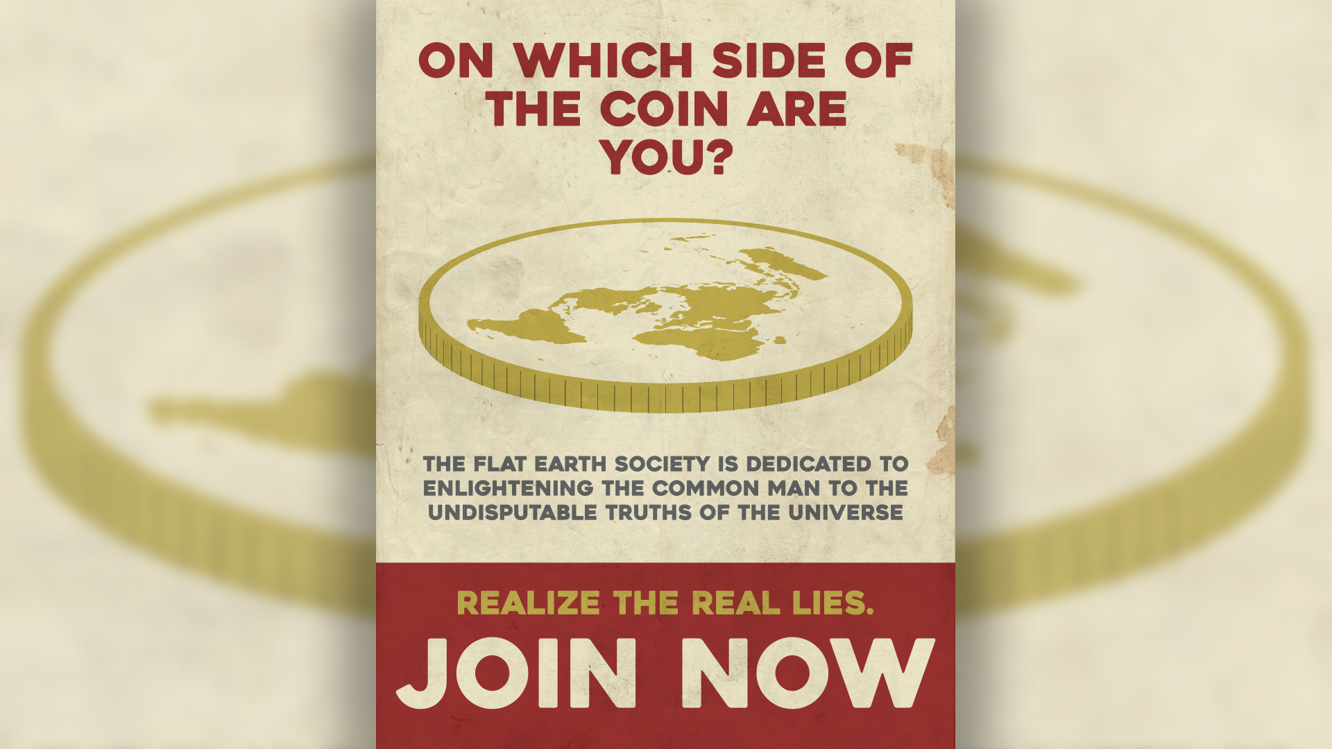
Flat Earth Poster

A very real propaganda poster created for a laugh. Click here to read the story behind this project.
This piece’s style was heavily inspired by World War II propaganda posters. This influence is seen in the choice to limit the color pallet to only a handful of values, in the use of a bold sans-serif font, and in the somewhat cartoon approach. The biggest and most direct inspiration however, was another modern rendition of the style, a piece by Zach Hoskins.1 This was the origin of both my color choice and the general structure of the poster. Our common “catch phrase on top, boxed message on bottom” is not original to either of us though, it is quite prevalent to WWII propaganda in general.
The coin was the most interesting asset to make. It is actually composed of two elements, the top being a 3D rotation of the first element, and the side being a 3D extrusion effect applied to the second element.

The coin top element (left) and coin side element (right) before the applied effects
The “polar azimuthal equidistant map projection” that is seen on the coin top was pulled from the United Nations emblem.2 The coin side element just has slight dark lines along bottom, which gives the coin its ridges. For whatever reason, Illustrator doesn’t render these perfectly when the 3D extrude effect is applied, leaving some of the ridges thicker than others. One might be able to compensate for this by giving the dark lines different widths, but frankly, it wasn’t worth the effort.
I also have to credit my good friend Alex for helping with the body text. I think we reached a good middle-ground between “condescending and ludicrous enough that we properly make fun of flat-earthers,” and “still plausible enough that someone might smugly post this on Facebook thinking that it is serious.”
Furthermore, the grunge layer I used was a paper texture from which I removed the fold lines in Photoshop. I can’t seem to prove it’s origin, but I suspect that this DeviantArt post by bashcorpo is the original. I really like the darker elements and the right-side stains in this texture.
With regards to the font, I no longer know what exactly I used, and online font identifiers don’t bring up anything that I recognize. I’m fairly certain that it was just a gothic style typeface, but again, I can’t be sure. Regardless, there are plenty of fonts that look extremely similar, so no one should have a hard time finding one if they need it.
